Color Psychology in Home Design
Colors influence how we experience the spaces around us. They can make a room feel calm and comfortable, create a sense of energy, or change how large and bright an interior appears. In home design, choosing the right colors is not only about personal taste but also about creating an atmosphere that suits the purpose of each room.
Color psychology explores how people respond to different colors and how these responses may influence mood, attention, and perception. Although reactions vary depending on personal experiences, culture, lighting, and context, color can be a useful tool when planning a home.
Understanding the basics of color psychology can help you create interiors that feel welcoming, balanced, and practical for everyday life.
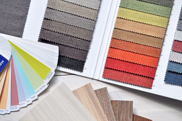
How Colors Influence the Atmosphere of a Home
Color is one of the first things people notice when entering a room. It interacts with furniture, lighting, textures, and decorative elements to shape the overall impression.
Some colors are often associated with particular moods. Blue may feel restful, yellow can suggest warmth and optimism, and green is frequently connected with nature. However, these associations are not universal rules. The same color can feel relaxing or overwhelming depending on its shade, intensity, and surroundings.
Three characteristics are especially important when choosing colors:
- Hue: The color itself, such as blue, green, red, or yellow.
- Saturation: How intense or muted the color appears.
- Lightness: How light or dark the color is.
A pale blue wall may create a very different impression from a deep navy wall, even though both belong to the same color family. Muted shades often feel softer, while highly saturated colors tend to attract more attention.
The Meaning of Popular Colors in Interior Design
Each color can contribute a different visual and emotional quality to a room. The best choice depends on the atmosphere you want to create and how the space will be used.
Blue: Calm and Balance
Blue is often associated with calmness, stability, and freshness. Lighter shades can make a bedroom or bathroom feel airy, while darker blues add depth and a more dramatic appearance.
Blue works well in bedrooms, reading corners, and home offices where a quieter atmosphere may be desirable. To prevent a cool blue room from feeling too cold, combine it with warm wood, cream textiles, or soft lighting.
Green: Nature and Relaxation
Green is strongly associated with nature, growth, and balance. Shades such as sage, olive, and moss can bring a natural quality to interiors without overwhelming the space.
Green is a versatile option for living rooms, bedrooms, kitchens, and workspaces. Pair it with wood, stone, cream, or other natural textures for a harmonious look.
Yellow: Warmth and Optimism
Yellow can make a room feel cheerful, warm, and inviting. Soft butter yellow or pale gold can add warmth without dominating the design.
It can work particularly well in kitchens, breakfast areas, and rooms with limited natural warmth. Strong, highly saturated yellow may feel intense when used across large surfaces, so it is often best introduced through smaller areas or accessories.
Red: Energy and Boldness
Red is visually powerful and is often associated with energy, warmth, and excitement. Depending on the shade, it can create a dramatic, intimate, or traditional atmosphere.
Because bright red attracts attention, it may be more effective as an accent color, in artwork, or on a single wall. Deeper shades such as burgundy and muted terracotta can feel more restrained and sophisticated.
White: Simplicity and Light
White is often used to create a clean, bright, and spacious appearance. It can reflect available light and provide a neutral background for furniture, artwork, and decorative objects.
However, a room that is entirely white may feel sterile or visually flat. Different white tones, textured fabrics, warm wood, and layered lighting can add depth and comfort.
Gray: Sophistication and Neutrality
Gray offers flexibility and can make an interior feel modern, understated, or elegant. Light gray can work as a neutral backdrop, while charcoal creates contrast and visual depth.
The undertone matters: some grays appear blue and cool, while others have warm beige or brown notes. Combining gray with natural materials or warmer colors can prevent a room from feeling uninviting.
Orange: Creativity and Sociability
Orange is often associated with enthusiasm, warmth, and social interaction. Muted terracotta and burnt orange can add character without making a space feel too bright.
These shades can work well in dining areas, creative spaces, and living rooms. If you prefer a more subtle effect, introduce orange through cushions, artwork, rugs, or decorative accessories.
Choosing Colors for Different Rooms
The purpose of a room should guide your color choices. A bedroom may benefit from a quieter palette, while a kitchen or playroom might suit more energetic accents.
|
Room |
Color Ideas |
Design Goal |
|
Bedroom |
Soft blue, sage green, warm beige |
Create a restful atmosphere |
|
Living room |
Warm neutrals, muted green, terracotta |
Encourage comfort and conversation |
|
Kitchen |
Cream, pale yellow, soft green |
Create a fresh and welcoming space |
|
Home office |
Muted blue, green, balanced neutrals |
Support a comfortable working environment |
|
Bathroom |
White, pale blue, light green |
Create a clean and refreshing impression |
|
Children's room |
Gentle green, soft yellow, selected bright accents |
Support play without overwhelming the space |
These are starting points rather than strict rules. A person who loves deep colors may feel more comfortable in a dark bedroom, while someone else may prefer a bright, neutral environment.
It is also useful to consider how rooms connect. When spaces are visible from one another, repeating a few related colors can help the home feel cohesive.
How Lighting Changes the Way Colors Look
A color rarely looks exactly the same in every environment. Natural light, artificial lighting, room orientation, and nearby surfaces can all affect its appearance.
A warm light source can make whites and neutrals appear more yellow or creamy. Cooler lighting may emphasize blue or gray undertones. A wall exposed to direct sunlight can also look noticeably different from the same color in a shaded corner.
Before choosing paint or wallpaper, consider these practical steps:
- Test samples directly on the wall rather than relying only on small printed swatches.
- Observe the samples in the morning, afternoon, and evening.
- Check the colors under the lighting you normally use.
- Compare the samples with your flooring, furniture, and curtains.
- Remember that glossy and matte finishes reflect light differently.
Testing colors in the actual room is one of the most reliable ways to avoid an unexpected result.
Creating a Balanced Color Palette
A successful interior usually combines a few coordinated colors rather than using every shade independently. A simple palette can make it easier to choose paint, furniture, textiles, and accessories that work together.
Start With a Base Color
Choose a main color for large surfaces such as walls, floors, or major furniture pieces. Neutral shades are popular because they provide flexibility, but a muted green or soft blue can also serve as a base.
Add a Secondary Color
A secondary color creates variation and helps define the character of the room. For example, a beige living room might include sage green curtains or a muted blue armchair.
Introduce an Accent Color
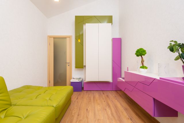
Accent colors add contrast and draw attention to selected details. You might use terracotta cushions, yellow artwork, or dark blue decorative objects.
Consider the 60-30-10 Guideline
One common interior design guideline suggests using approximately 60% of a dominant color, 30% of a secondary color, and 10% of an accent color. These proportions can be a helpful starting point, but they are not a requirement. Different room sizes, styles, and personal preferences may call for a different balance.
Textures are equally important. Linen, wool, wood, stone, and metal can make a simple palette feel richer without adding many new colors.
Common Color Design Mistakes to Avoid
Even attractive colors can be difficult to live with if they are used without considering the room as a whole.
Choosing paint without testing it. A shade that looks perfect in a store may appear much darker or cooler at home. Always test samples under real lighting conditions.
Using too many competing colors. A large number of unrelated shades can make a room feel visually busy. Choose a small group of colors and repeat them throughout the space.
Ignoring undertones. Two shades of white or gray may clash because one has a cool undertone and the other a warm one. Compare samples side by side before making a decision.
Following trends without considering personal comfort. Popular colors change, but your home should reflect your preferences and daily habits. Use trends for easily replaceable items if you are unsure about committing to a bold wall color.
Assuming dark colors always make rooms smaller. Dark shades can create depth and a sense of intimacy. The result depends on lighting, contrast, room proportions, and how the color is distributed.
Conclusion
Color psychology can be a useful starting point for creating a home that feels comfortable, welcoming, and suited to everyday life. Blue and green are often associated with calmness, yellow and orange can add warmth, and neutral shades provide flexibility and balance.
However, color preferences are personal, and their effects depend on more than the color itself. Lighting, room function, texture, cultural associations, and individual experiences all influence how an interior feels.
The best approach is to experiment with samples, consider how each room is used, and choose combinations that make you feel comfortable in your own space. A thoughtfully designed color palette does not need to follow strict rules; it needs to work for the people who live there.
Frequently Asked Questions
Consider the room's purpose, natural light, existing furniture, flooring, and personal preferences. Test paint samples on the wall and observe them at different times of day before committing to a final color.


Was This Article Helpful?
Click on a star to rate it!
Thank you for your vote!
Average Rating: 0/5 Votes: 0
Be the first to rate this post!

Strong engineering background in mobile and backend development. Focusing on building scalable products, improving development processes — from architecture and APIs to UX redesigns, monetization, and analytics. Responsible for applications with 1M+ downloads and multi-project ecosystems.
View LinkedIn ProfileLatest Posts

Lifestyle Design for Personal Freedom
Outdoor DIY Projects for Your Backyard
Fashion Weeks and Their Cultural Impact